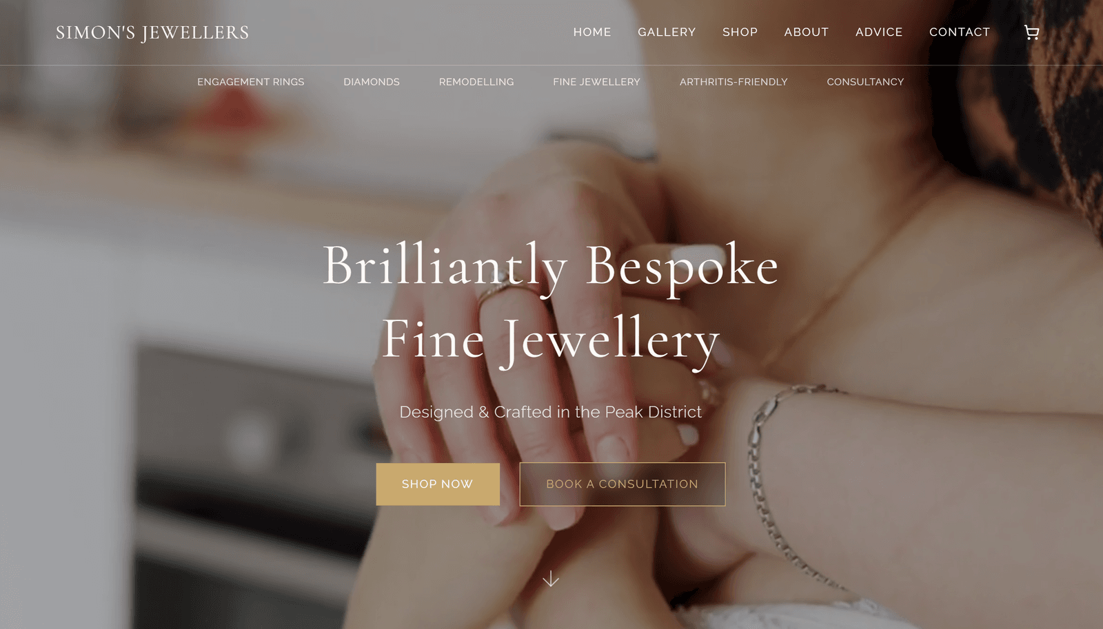
Simon's Jewellers
A luxury digital atelier for an independent Peak District jeweller, blending artisanal heritage with interactive diamond expertise.
Role
- Lead Product Designer
- Full-Stack Engineering
- Brand Identity
Year
2025
Tech Stack
Overview
To transform a traditional, heritage-based independent jeweller into a high-end digital brand that balances artisanal craftsmanship with technical diamond expertise. The interface was designed to feel as intentional and high-quality as the jewellery itself: a digital atelier rather than a standard e-commerce experience.
Design Philosophy: "The Crafted Interface"
The core design goal was to move away from "standard e-commerce" and towards a "digital atelier." The interface is designed to feel as intentional and high-quality as the jewellery itself: minimalist, editorial, and spacious.
Colour Palette
Ivory
#FAF8F5 · Premium warmth
Charcoal
#1C1C1C · High contrast
Gold
#C9A96E · Luxury accent
Typography
- Cormorant Garamond (Serif): Used for headings, conveying heritage, elegance, and authority.
- Raleway (Sans-Serif): Used for body text and technical data, ensuring modern legibility.
Signature Interactive Features
These elements were custom-built to differentiate the brand from competitors. Each serves a specific brand pillar of Heritage, Precision, and Personality.
A. The Diamond Anatomy Explorer
A technical tour-de-force located in the "Advice" section, allowing users to visualise complex diamond metrics in real-time.
- Functionality: Interactive toggles for Round, Emerald, and Cushion cuts.
- Visual Feedback: A dynamic colour-grading slider that shifts the diamond render from D (Colourless) to J (Near Colourless) in real-time.
- UX Goal: To position Simon as a "Technical Specialist" rather than just a retailer.
B. The Master's Signature
A bespoke SVG animation that "inks" Simon's name onto the page as the user scrolls into the "Meet Simon" section.
- Execution: Uses
pathLengthanimation in Framer Motion to simulate the fluid motion of a fountain pen. - UX Goal: To add a human, artisanal touch that reinforces the bespoke nature of the business.
C. The "Solitaire Pulse" Preloader
A cinematic entrance that sets the mood before the site even loads.
- Visuals: A needle-thin ring silhouette with a "breathing" solitaire spark.
- UX Goal: To manage perceived wait times whilst establishing the brand's luxury identity immediately.
UX & Interaction Design
Glint Micro-interactions: Images feature a custom "glint" effect: a subtle lens flare that follows the cursor, mimicking the way light hits a real gemstone.
Synchronised Reveals: Page content is timed to slide in exactly as the preloader finishes, creating a seamless "unveiling" effect.
Themed Scrollbar: Even the browser's utility elements were styled (Gold thumb on Ivory track) to ensure the brand experience is never broken.
Bento-Grid Gallery: A sophisticated masonry layout that allows for high-density visual storytelling without feeling cluttered.
Information Architecture
The site is structured to guide the user through a "Trust Funnel":
Aspiration
High-impact video and "Brilliantly Bespoke" messaging
Expertise
Clear breakdown of Repair, Remodel, and Design services
Proof
Visual evidence of craftsmanship through gallery
Authority
Educational tools such as the Diamond Explorer that build trust
Connection
Low-friction consultation booking
"The website's code is as precise as the jewellery's setting. Every animation (the signature, the diamond explorer, the preloader) was built to serve a specific brand pillar: Heritage, Precision, and Personality."